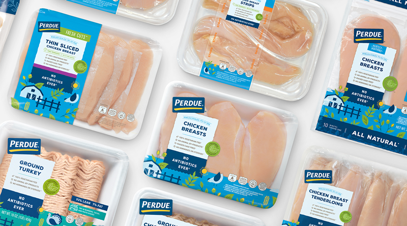
To enhance credibility and preference amongst today’s evolving consumer, PERDUE® is introducing a new, modern package design for its line of fresh chicken. The contemporary design introduces a variety of playful illustrations and vibrant colors aimed to inspire and connect with the millennial demographic, while staying true to the PERDUE® way. The re-design also highlights trusted product attributes like no-antibiotics-ever, 100 percent vegetarian fed, no animal by-products, raised cage free and with no hormones or steroids*.
This re-brand makes the fourth major packaging update in the history of the brand, further highlighting key brand messages and attributes with shoppers. Resonating extremely well with consumers, more than 65 percent of overall participants surveyed in a brand consumer test favored the new design and millennials preferred the updated look 200 percent more.
“Fifty years ago, my dad put our family name on chicken. It was more than a label, it was his personal promise of quality,” said Jim Perdue, chairman and brand spokesman. “Over the years, our look has changed and so have we. Perdue is continually improving everything we do, and that’s why we’re introducing new packaging for our fresh chicken.”
Consumers will begin to see the bright new packaging in stores mid-September and can expect a fresh new look on the PERDUE® website and other digital platforms as well. And even though there may be a fresh new look, it is the same tender chicken you expect from Perdue.
Source: PERDUE®


